Introducing Motif - The No-code Graph Visualization Platform
Motif makes visual discovery on graph datasets simple and accessible to analysts, data scientists and managers.
C
Cylynx
June 18, 2021 · 5 min read


Motif makes visual discovery on graph datasets simple and accessible to analysts, data scientists and managers.
Cylynx
June 18, 2021 · 5 min read
“working data scientists make their daily bread and butter through data collection and data cleaning; building dashboards and reports; data visualization; statistical inference; communicating results to key stakeholders; and convincing decision makers of their results”
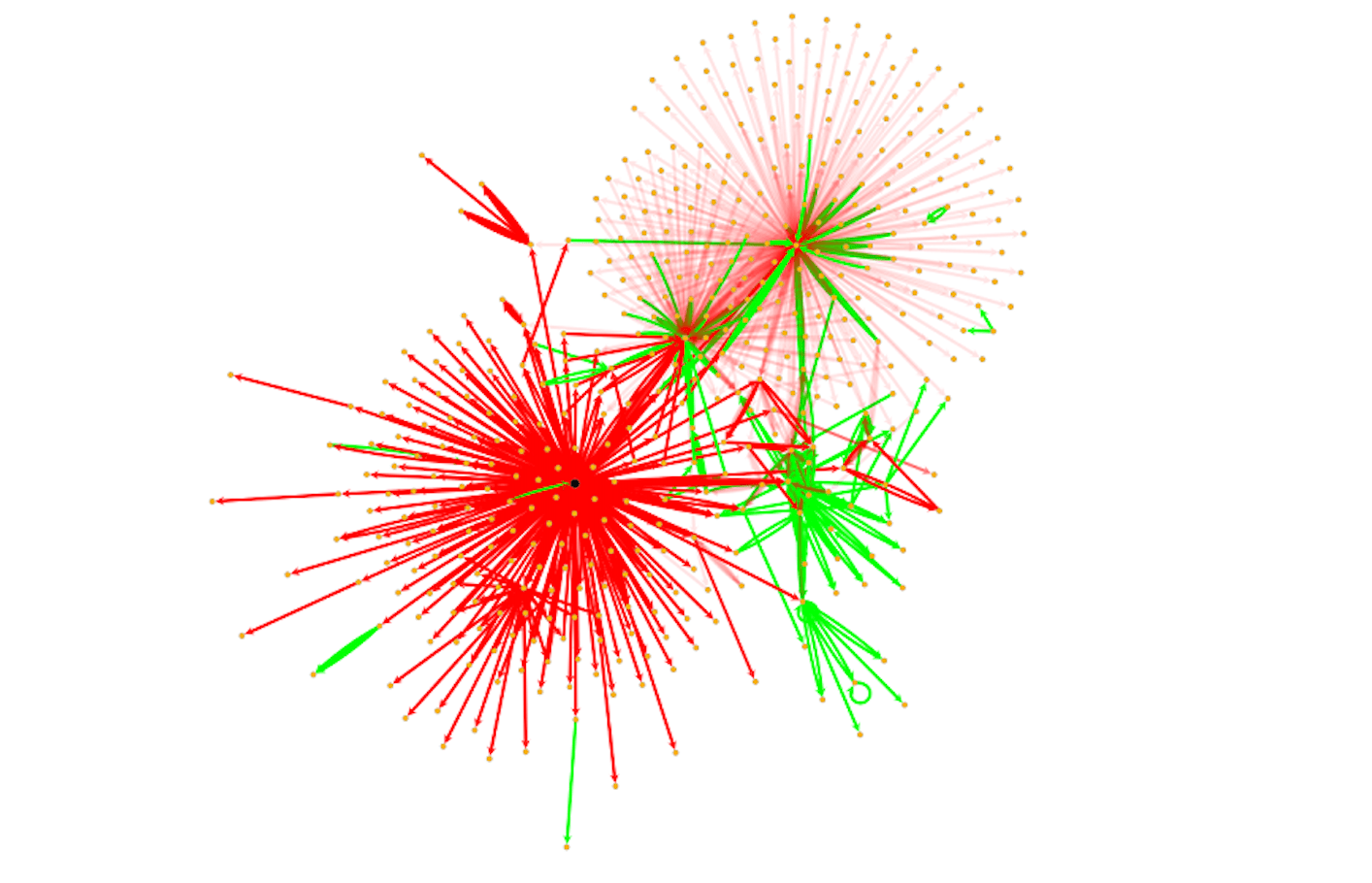
Data visualization and exploration is a useful way to identify summaries, structure, uncover hidden relationships, trends, differences, abnormalities or insights from data.
While there are plenty of tools to assist in data visualization of tabular data, the same cannot be said for graph data.
Drawing on our past experience in graph data science consulting and solution development, we realized there is a need for an easy tool to empower teams to quickly understand and derive insights from their connected datasets.
After a year of incubation and development, we are proud to release Motif, a no-code graph visualization platform to the community. We hope this tool will help analysts, data scientists and managers connect the dots between their data and make graph exploration accessible and fun!
Dive right into our demo and open source repository or continue reading on to learn more about the challenges of graph data exploration and how Motif aims to solve them.
From our past experience working on graph data science projects, here are 4 problems we commonly encounter in enterprise graph adoption:
Trying to understand relationships through a tabular representation
As most enterprises are built on relational database systems, they tend to work within the confines of a tabular data model. However, modelling relationships as graph structures is arguable a more intuitive way to think about things and also provides more flexibility in analysis and discovery.
Difficulty in data exploration and discovery
Visualising relationships within graph data is regarded as a difficult and time-consuming task. Often this requires the assistance of data scientists to fiddle with plotting softwares like networkx or igraph which are neither interactive nor easy for business teams to make sense of.
Difficulty in dealing with high dimensional data
On top of the relationship structure of the graph, a real-world graph typically includes multiple edges, numerous node/edge properties, different node/edge types, and additional time dimension which has to be taken into account. Representing and trying to understand a rich graph dataset is a challenging process.
Sharing findings and results is tricky
Unlike the traditional business intelligence space where there are plenty of tools like Tableau and PowerB, sharing insights on graphs is still relatively tedious.
At Cylynx, we build tools and solutions to help financial crime investigators connect the dots between their data points. Such data is best represented and processed as graphs.
Combining the needs of our various project deployments and interviews with business stakeholders, we created Motif to make graph discovery simple and accessible to analysts, data scientists and managers.
Motif is a no-code, graph visual discovery tool that speeds up data exploration, analysis and collaboration across teams. Collaborating and sharing graphs is made easy on Motif.
We recently released our public version of Motif, which can be found open-sourced on Github over here. You can give Motif a try here and let us know what you think on our discussions page!

Import Options
Layout and Styling Options

Filters and Search

Share, Collaborate and Customise
Here are some ideas to get you started on graph data exploration with Motif
Simply import your json or csv data through the Motif web application, or click on one of the sample datasets to get started! The data should have a source and target field to represent the edge links. As Motif is a front-end only application, all your data resides securely within your computer.

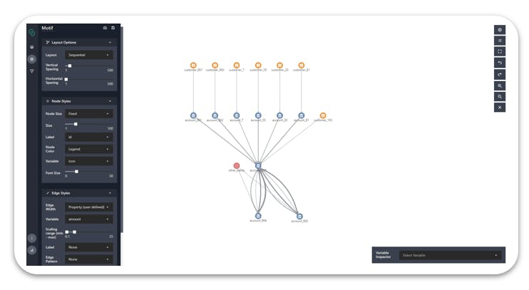
After your data is imported, customize the styles by clicking on the palette button on the left-hand side of the application. You can adjust the layouts, node styles and edge styles.

Add filters to your graph to limit the data that is displayed. This can be added using the main widget panel on the left-hand side or through the variable inspector widget at the bottom right-hand corner of the application. The filters in the variable inspector section function as a soft filter to help you focus on the area of interest. Try filtering on a time-series attribute and using the playback action buttons to visualize activities over time.

The search panel on the left-hand side can be used to select nodes or edges of interest. You can also select multiple nodes and edges on the canvas by shift-clicking and dragging them. Information on these nodes can then be viewed on the search panel.

We hope this gives you a good overview of the features of the platform. Once you are satisfied with your masterpiece, simply save your data using the save button located at the top of the data sources panel. You can share the data file with your colleague and she can easily re-import it to motif by dropping the file in the import data dropzone.

To support data scientists in graph visualization, we released a corresponding Jupyter widget package called pymotif. This enables data scientists to work in the interface that they are already comfortable and familiar with but also take advantage of the visualization capabilities of Motif.
Motif provides out of the box support for networkx graphs. Simply download it from the pip registry and try it out.
pip install pymotif
Here’s a short code snippet to get you started:
from pymotif import Motif
import networkx as nx

# path to local dataset
gml = 'data/karate.gml'

# read using networkx
nx_graph = nx.read_gml(gml)

# Plot networkx graph with Motif
motif_nx = Motif(nx_graph=nx_graph, title='NetworkX')
motif_nx.plot()
Other supported data types include json files, csv files and neo4j graphs. A notebook offers you a convenient way of sharing data insights with your team. Remember to save the widget state, before saving the notebook file to persist the interactive graph visualizations. You can then export to html or upload it to the web and view it on nbviewer. Here’s our introductory notebook with Motif embedded and visualized on nbviewer.
Check out our sample notebooks for more examples and try it out with your own datasets.
![]()
Motif integrates with Neo4j, so you can easily share your Neo4j findings without sharing your database access.
Use Neo4j as your data store and experiment with different graph algorithms from Neo4j’s data science library. When you are satisfied with the results, you can then use Motif’s cypher query integration to visualize it on the front-end, and email the data file or share the link with any recipient.

We have released the open-source version of Motif to empower analysts, data scientists and managers to generate insights from their graph datasets.
You can try out the Motif no-code graph visualisation platform here. Let us know what you think over at our github discussions board.
If you are looking to embed Motif within your organization’s workflow, feel free to contact us here for more information. We provide custom data integrations, user access controls with additional capabilities for enterprises.