Data Exploration and Visualization of Uniswap Activities with Neo4j and Motif
A walkthrough on using graph analytics to query for patterns of interest on Uniswap with the help of Bigquery, Neo4j and Motif.
C
Cylynx
June 30, 2021 · 5 min read


A walkthrough on using graph analytics to query for patterns of interest on Uniswap with the help of Bigquery, Neo4j and Motif.
Cylynx
June 30, 2021 · 5 min read
Blockchain technology like Bitcoin and Ethereum provides a decentralized environment for financial transactions. Transactions are recorded in a distributed ledger (aka blockchain) and are immutable. This means that the entire historical data and activities on the blockchain are readily available and cannot be manipulated mathematically.
These twin properties of trusted execution without a centralized authority has attracted the growth of decentralized finance activities. These include the likes of Uniswap, a decentralized exchange or Aave, a decentralized lending platform.
Our previous articles showcase some of the risks involved with some protocols. In this article, we expound on some of the exploratory techniques used in blockchain forensics and how we can analyse decentralized finance activities with Neo4j and Motif.
“However, not only does the blockchain act as a public ledger for every financial transaction on the bitcoin network, it can also be adapted to suit other needs such as file storage, property ownership, trading of assets, or even verifying the manufacturing process of medicine. The possibilities are really only limited to the bounds of human ingenuity.”
— Prypto
While Bitcoin first introduced the idea of blockchain to the masses, Ethereum aims to revolutionize the world by bringing in smart contracts. In short, smart contracts allow for self-execution of tasks based on the rules/codes defined, removing the need for a middleman. This has brought on many real-world applications, highlighted in the quote above, to the Ethereum network, due to the cost efficiency and simplicity for businesses.
 In this article, we will be analysing Uniswap in greater detail. Uniswap is a collection of smart contract programs that functions as a decentralized exchange (DEX) on the Ethereum chain. As of June 2021, it claims to have facilitated 54 million trades with an all time volume of $290 billion.
Like centralised exchange (CEX) counterparts like Binance or Robinhood, it provides crypto trading services to users. Unlike CEX, users are in custody of their own funds and digital assets can be traded in a permissionless and automatic way without any Know Your Customer (KYC).

To keep the trading system liquid at all times, Uniswap relies on 2 groups of users. Liquidity providers loan their crypto to the liquidity pool in return for attractive yield. They are also able to withdraw their liquidity at any given time. On the other side, traders swap tokens, based on prices mathematically determined by the liquidity pool. Traders also pay trading fees which goes to the platform and the liquidity providers.
In a previous post, we showed how graph analysis can be used to understand the structure of exchanges on the Ethereum chain. For smart contract analysis, we take a similar approach to understand activities through a semantic graph structure.
We model wallets or smart contract addresses as nodes and contract calls as edges. The bulk of Uniswap transactions is made up of these 3 call functions: Supply Liquidity, Remove Liquidity and Swap. Each of these actions also contain additional information such as the number of tokens received or transferred.
This gives a rich multi-edge graph with multiple node and edge properties. In order to get a sense of the usual patterns or activities that take place on the graph, we need tools to help us easily query and visualize such rich graph structures.
We use Neo4j as its property graph model allows us to model the rich relationships present in Uniswap data. We also leverage Motif, our open-source graph exploration tool to interactively explore the patterns and behaviours.
Uniswap data can be retrieved by directly syncing an Ethereum node and filtering on the address of interest or by querying from Bigquery. Bigquery Ethereum ETL offers a convenient entrypoint for us to analyze historical blockchain activities.
From Bigquery, Uniswap transactions can be retrieved from the blockchain-etl.ethereum_uniswap directory. Under the folder, transactions are already categorised into the corresponding tables based on their call functions.
 For our example, we will be utilising 3 tables: UniswapV2Pair_event_Swap, UniswapV2Pair_event_Burn (removing liquidity) & UniswapV2Pair_event_Mint (supplying liquidity). With some data cleaning and understanding of smart contract transactions, we extract out only the necessary information into standard nodes and edges format for graph visualization. For edges, there will be 3 different files corresponding to the 3 call functions.
We load a subset of the transformed dataset into neo4j for further analysis.
As mentioned above, we model the smart contract calls using a property graph model with nodes as wallets or smart contract addresses and edges as function calls, along with other associated properties.
Here’s a sample of a few transactions that are associated with the CEL-ETH liquidity pool.

From the graph, we understand that any of the users (yellow nodes) who wish to supply/remove CEL-ETH pair or trade between CEL and ETH token will interact with the corresponding liquidity pair token address (purple node). Edge attributes contain the number of tokens supplied/removed/swapped by the user.

We can directly query from Neo4j into Motif to explore specific parts of our dataset in greater detail. Here, we visualized 4 different liquidity pools and their users over a specific timeframe.
We can clearly see that the LINK-ETH liquidity pool (orange node) has the most traffic based on the number of edges and nodes surrounding it. Based on the swap (red) and supply (blue) edges, it can then be inferred that the LINK-ETH pair has the highest trading volume and the largest supplied liquidity out of the pools here.

Motif allows us to add in custom filters and visualize activities over time. In the above plot, we drill down into transactions which involve either LINK or SUSHI tokens and use the variable inspector panel to filter on a subset of block numbers of interest.
We can also extend the use of graph visualisation to filter out malicious and suspicious patterns. More recently, decentralized finance (DeFi) space in crypto has been under flash loan attacks. DEXes such as Uniswap, Sushiswap and Pancakeswap, where the latter 2 being the fork of Uniswap, supports flash loans. This is a type of contract that allows traders to borrow large amounts of capital, make any trades, supply/remove liquidity, and repay back the capital all in one transaction. If any condition (as set by the trader) fails in any one of the steps, the transaction will be reverted. This is used by arbitrageurs who capitalize from the price differences between DEXes.
However, this has resulted in exploiters taking advantage of the coding vulnerabilities of the projects listed in the DEXes. Pancake Bunny and Alpha Homora are some of the prominent victims, losing tens of millions from the attacks.
Back to our Uniswap example, we can attempt to filter out a similar pattern used by the exploiters of Pancake Bunny using Neo4j’s Cypher query language. The attack involved triggering several swaps, supply and remove liquidity call functions within a very short time window, using a combination of flash loans and normal transactions.
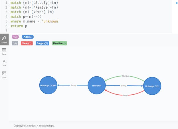
In the graph above, we managed to obtain 1 case based on that attack pattern. The unknown trader (middle node) is supplying, swapping, and removing liquidity with the Celsius liquidity pool, in addition to supplying liquidity to the Compound liquidity pool. All of these actions are done within 15 minutes and are otherwise not observed among other traders.
Including more detailed filtering conditions such as the amount of crypto involved and other attributes can help paint a more complete picture.
We hope this article gives you an insight into how graph analysis is a perfect fit for blockchain forensics especially in the area of DeFi analytics.
Getting started is easy - many of the tools highlighted in this post have a free trial or open source version:
If you are interested in a more detailed walkthrough of Motif, check out our previous post and the open source github repository. If you require custom analytics and reports on the blockchain, feel free to reach us on our contact form.